
Supreme's SS26 rollout follows the familiar two-step format: the lookbook establishes the full styling language, and the preview makes category-level buying intent clearer. Read together, they show not only what the season looks like, but how it is meant to be worn and shopped.
Source links
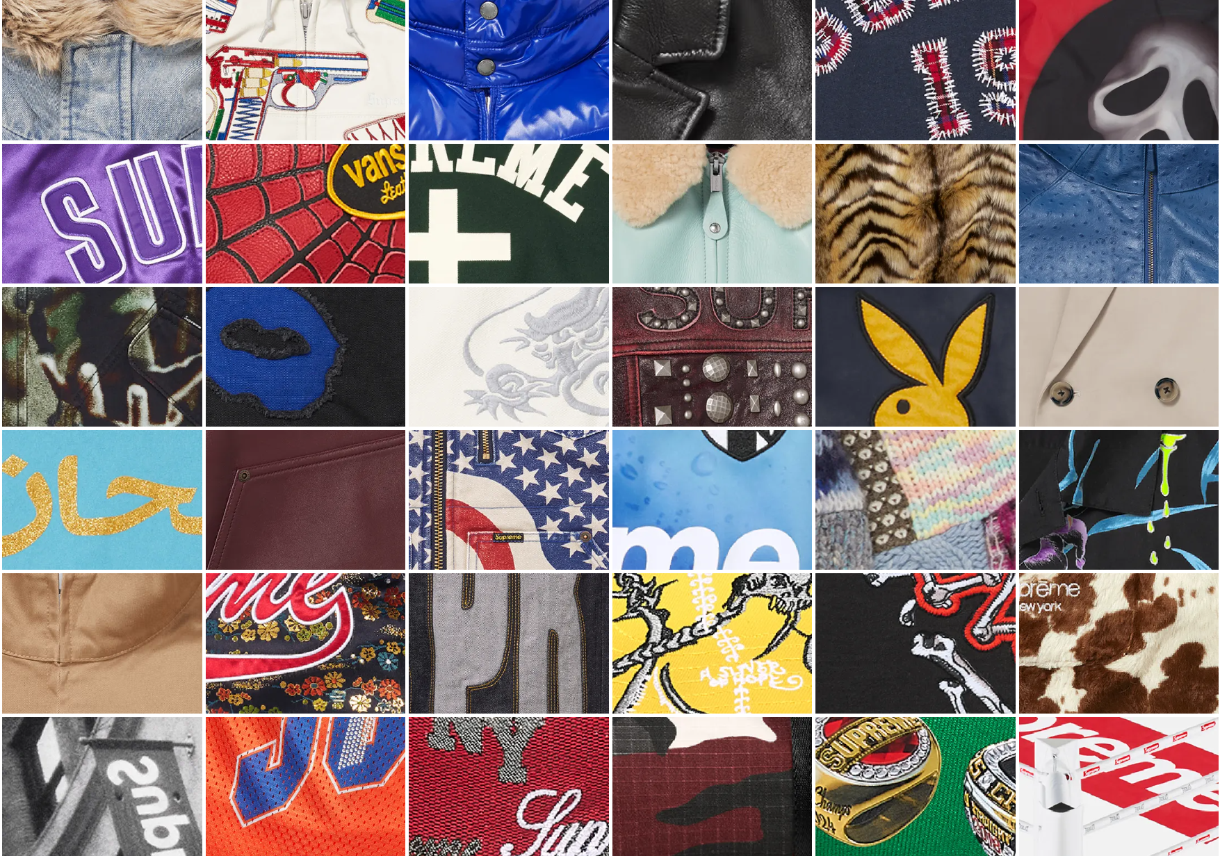
First read: styling before hype
The strongest signal in SS26 is how complete the looks feel from head to toe. Instead of isolated statement pieces, the lookbook pushes full outfits with tighter proportion control and clearer layering logic. That matters because Supreme seasons tend to perform best when the styling system is coherent, not just loud.
Piece spotlight: Supreme/Fiji Soccer Jersey
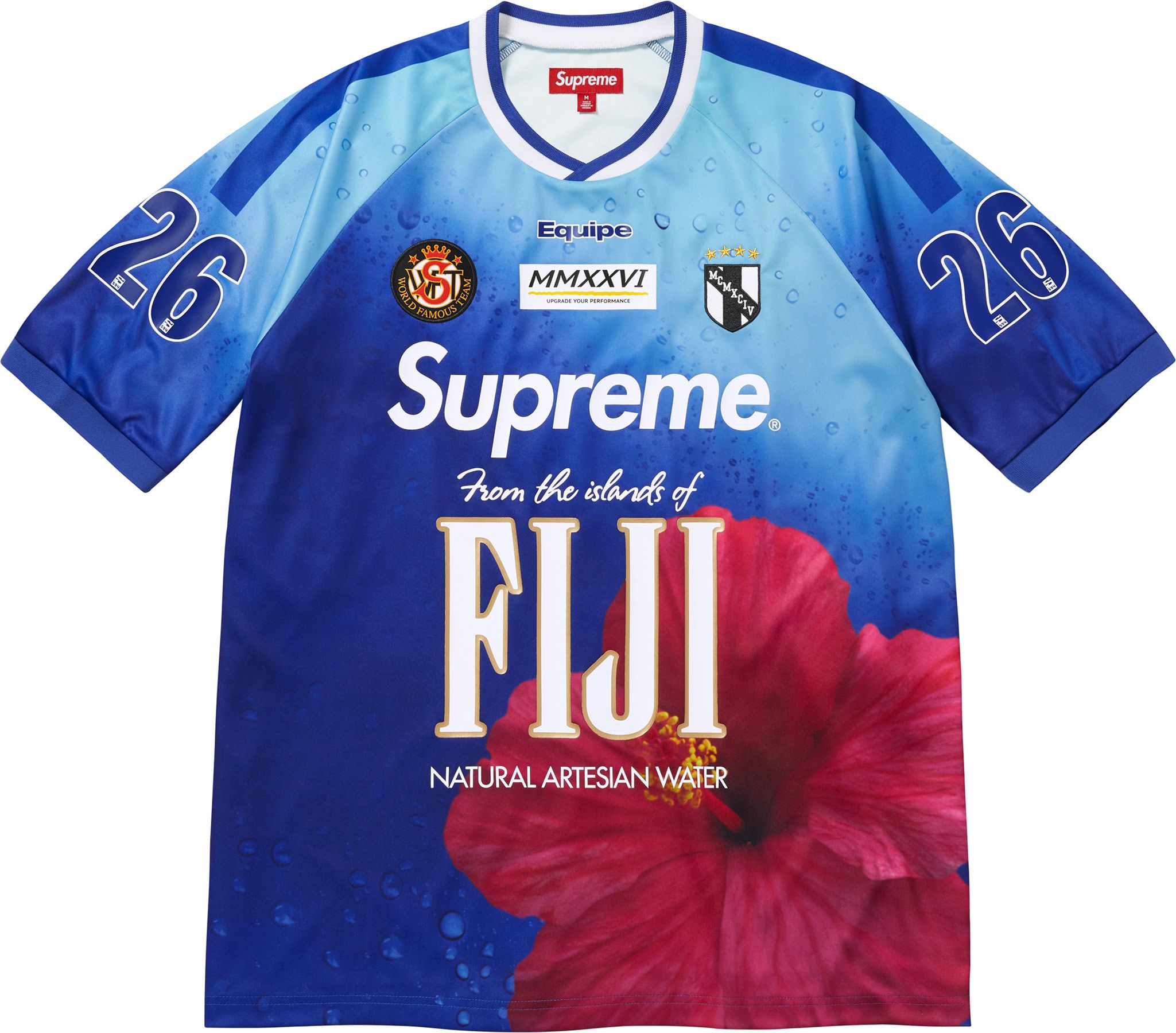
One of the clearest standouts is the Supreme/Fiji Soccer Jersey. The piece works because it blends multiple visual codes at once: football-shirt blocking, travel-poster color drama, and classic beverage-sponsor parody language. The big "FIJI" front graphic and hibiscus print give it instant shelf impact, while the cut stays wearable enough to be styled beyond novelty.
From a buy perspective, this is the kind of top that performs as a conversation piece early in the season and then holds value as a recognizable SS26 marker. It is loud, but it is also legible: you can anchor it with plain shorts, washed denim, or technical pants and keep the jersey as the full focal point.
Selected pieces: Supreme x Teenage Engineering collaboration
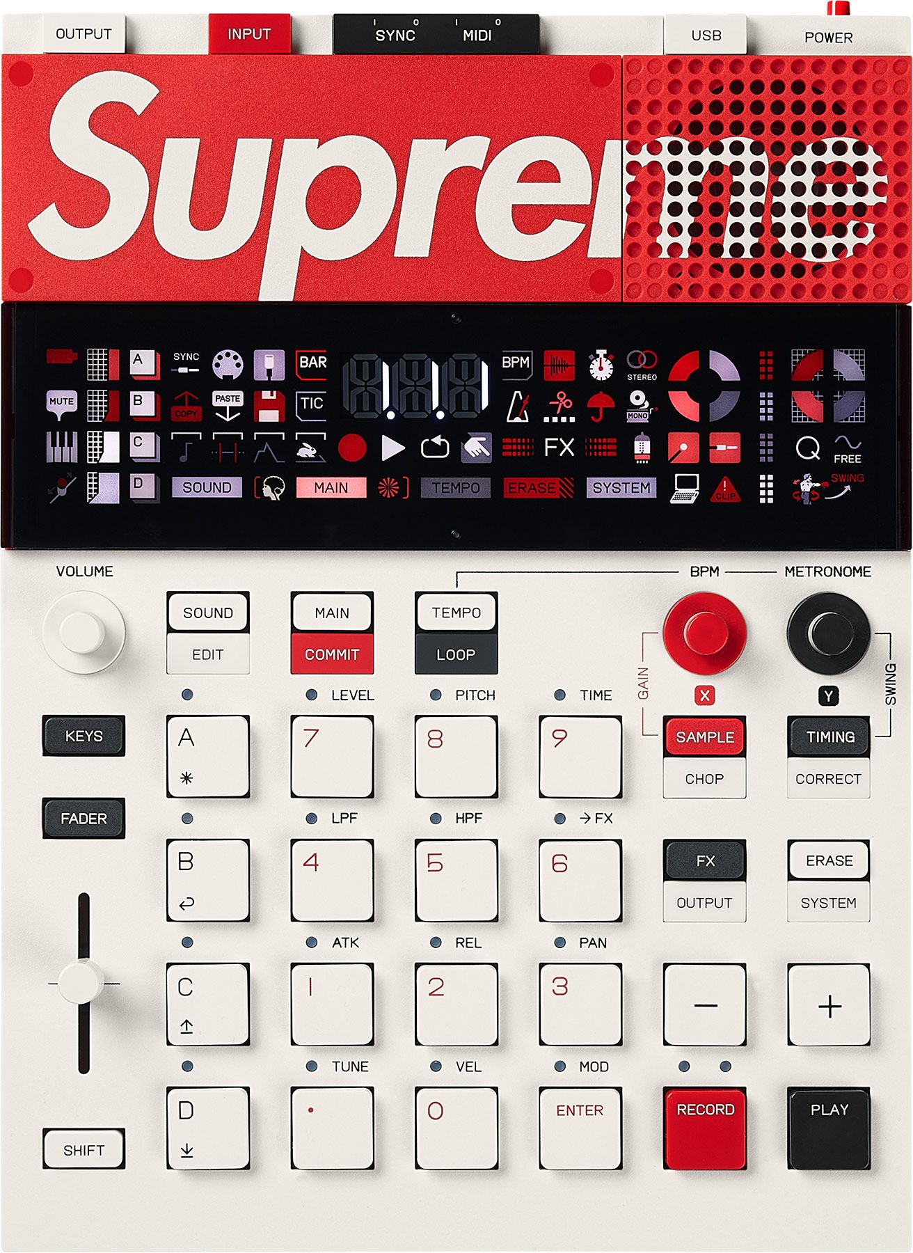
The Supreme x Teenage Engineering piece stands out as one of the most memorable objects in the SS26 orbit because it merges streetwear branding with Teenage Engineering's signature industrial design language. The red-and-white Supreme treatment on the hardware body gives it immediate shelf presence, but the layout still reads like a serious music tool rather than a novelty prop.
From a collector and buyer perspective, this kind of collaboration works on two levels: it is functional for sound-making and studio use, and it also carries the visual identity strength that Supreme collaborations are known for. In a season where styling coherence matters, this release extends the same idea into product design - clear identity, strong usability, and high cultural signal.
What the lookbook does well
- It frames the season around wearable combinations rather than novelty alone.
- It keeps the street-to-utility balance that Supreme does best: practical layers, graphic punctuation, and familiar wardrobe anchors.
- It gives enough visual structure for buyers to identify repeat-wear pieces, not only social media moments.
Buyer takeaways for SS26
If you're planning buys or coverage, prioritize in this order:
- Versatile outer and mid layers that support repeated styling.
- Clean baseline pieces that anchor louder capsules.
- One or two high-signal graphics instead of over-indexing novelty.
- Accessories with practical carry-over beyond opening-week hype.
Final word
SS26 looks most convincing when approached as a full wardrobe system, not a list of one off grails. The lookbook sets the silhouette and mood; the preview confirms the category strategy. Together, they suggest a season built for both cultural noise and real wear frequency.