Before anyone argues about a piece, someone flips it over. The neck tag names the house, the care label dates it, down to the season on strict systems. Sellers read them first, authentication guides are built on them, and My Clothing Archive fills in identification from label photos. On pieces worth real money, someone already wrote down what it is.
The paper trail holds strange stories too. A blank rectangle with no name on it, a season calendar typed into a washing tag, a government ration mark that owners cut out of their own coats. The label is the smallest document a garment carries, the most honest one.
The blank label was a decision
From 1988, the Maison Martin Margiela label was a plain white rectangle held at the nape by white basting stitches, no brand name printed anywhere. On unlined garments the stitches sit visible outside. The house's own brand code page calls its current system numeric coding, introduced in 1997: numbers 0 to 23 on white cloth, a circle around the line a piece belongs to. A 0 is Artisanal, the hand-reworked line. A 1 is womenswear, a 10 menswear, a 14 the men's wardrobe, a 13 objects and publications. SSENSE's house guide dates the numbered label to that same year.
The split came in 2008. The runway line kept the plain white label, Line 1 gained its circled number, Third Looks' reference guide records the change that March. A recent Margiela with no numbers at all walked a show rather than hanging in a shop. One circle of ink does the work of a filing system, and prices follow it.
Yohji wrote the calendar on the care tag
Y's was where Yamamoto started, womenswear in 1977. Menswear arrived as Y's for men in 1979, went on hiatus in 2010 and came back in 2023. The dating system lives on the care label, not the neck tag. Product codes there carry two letters, and the second letter narrows the season: the Truss Archive guide lists a B as SS95, SS00, AW06 or SS12, a J as SS98 or AW04 or SS10. Letter sizes on the size label mean 1995 through 1999, Japanese number sizes 2000 and after. The typeface joins in, serif care label details up to autumn winter 2009, sans serif from spring summer 2010. A J code, a size 3 and serif print is autumn winter 2004.
That fluency comes with suspicion attached. Sui Generis's care tag decoder notes how much care labels get faked, precisely because they look technical. Misaligned printing, impossible fibre data and code formats from the wrong era give copies away. Their advice on a doubtful tag: photograph it before anyone cuts it out, the contradictions may be the best evidence there.
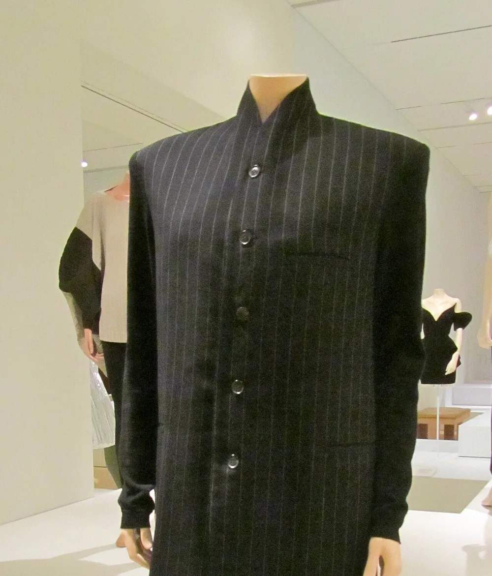
A Yohji Yamamoto wool coat from around 1990, a piece of the era when the care label calendar was in force. Photograph: ellenm1, CC BY 2.0 via Wikimedia Commons.
The state printed a brand
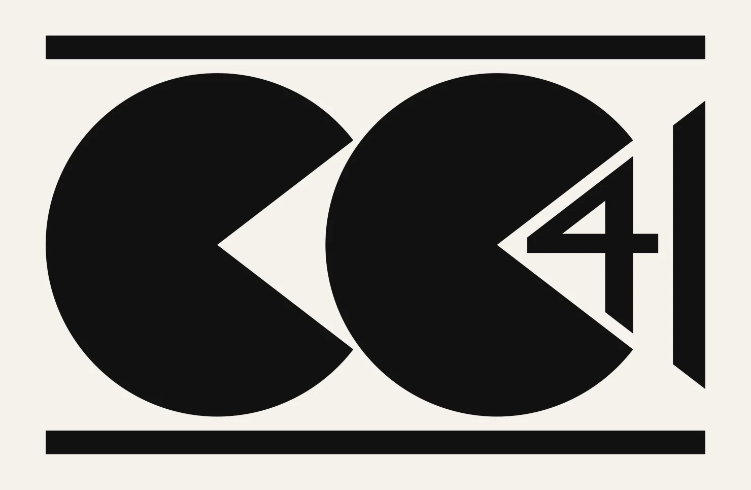
The strangest mark in the field is a government issue. In September 1941 the British Board of Trade introduced the CC41 utility mark, two letter Cs facing the number 41, and from the start of 1942 nearly all clothing made in Britain carried it. When the Board wanted a utility wardrobe, the Incorporated Society of London Fashion Designers submitted designs, none credited. The Collector's Companion records the post-1948 detail: an X before the code number meant better cloth, Super Utility.
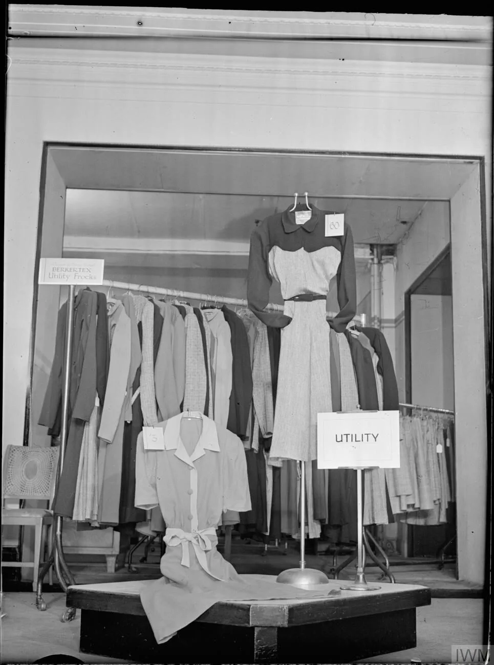
A utility shop display in Britain, 1942. Photograph: Ministry of Information Photo Division, public domain via Wikimedia Commons.
Then the part archive sellers know best. After the war, owners cut the mark out of coats they kept wearing rather than carry the ration stigma, so CC41 labels mostly survive faded or half missing. A brand mark that lowers the price of the garment it sits in, and gets scissored out by its own owners. Every other label discussed here earns a premium. This one is the exception, and it proves the rule about labels from the other side.
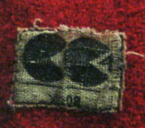
A CC41 label that survived in a red coat, formerly owned by Mona Roberts, on display at Bury Art Museum. Photograph: Chemical Engineer, CC BY-SA 4.0 via Wikimedia Commons.
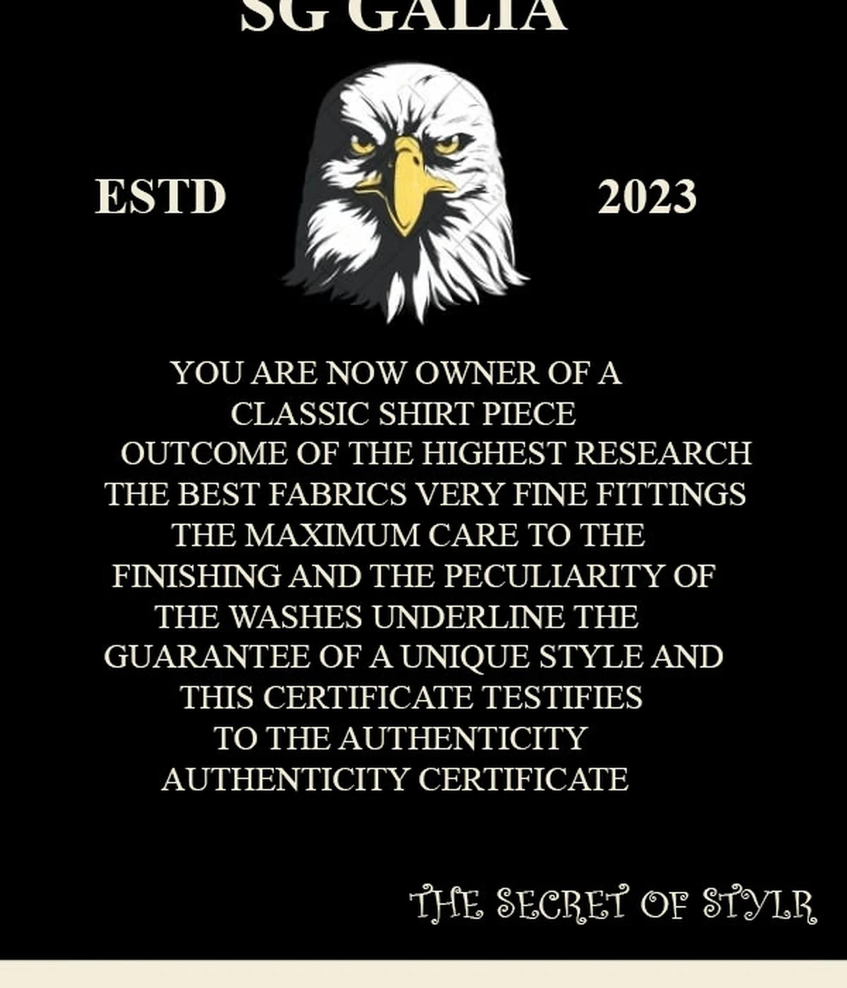
A 2023 care label from a contemporary shirt. Photograph: Surya Palanisami, CC0 via Wikimedia Commons.
Now the tag talks
Contemporary labels run the same trick in reverse. The tag photographed above reads YOU ARE NOW OWNER OF A CLASSIC SHIRT PIECE, THE BEST FABRICS, VERY FINE FITTINGS, guarantee language wrapped around washing instructions. A certificate of authenticity stitched inside a shirt nobody will ever resell, and the confidence is funny. Labels used to record. Now they perform.
Eme Studios, founded in Madrid in 2018, prints EMESTU, MADRID, ESP. on pieces like the Ledger raw denim pants, and runs collection names, Always Grateful this season, into the garments. ADER ERROR pushed its slogan the new is not new through a Converse collection called Create Next. The label is the smallest billboard a brand owns, in a spot most people only see while hanging the garment up.
Read it here
The archive proves the point both ways. A Supreme x Y's by Yohji Yamamoto silk zip up shirt from the two brands' September 2025 collaboration, which included an S/S shirt, is on the site in black now, 620 for a medium, 435 for a large.
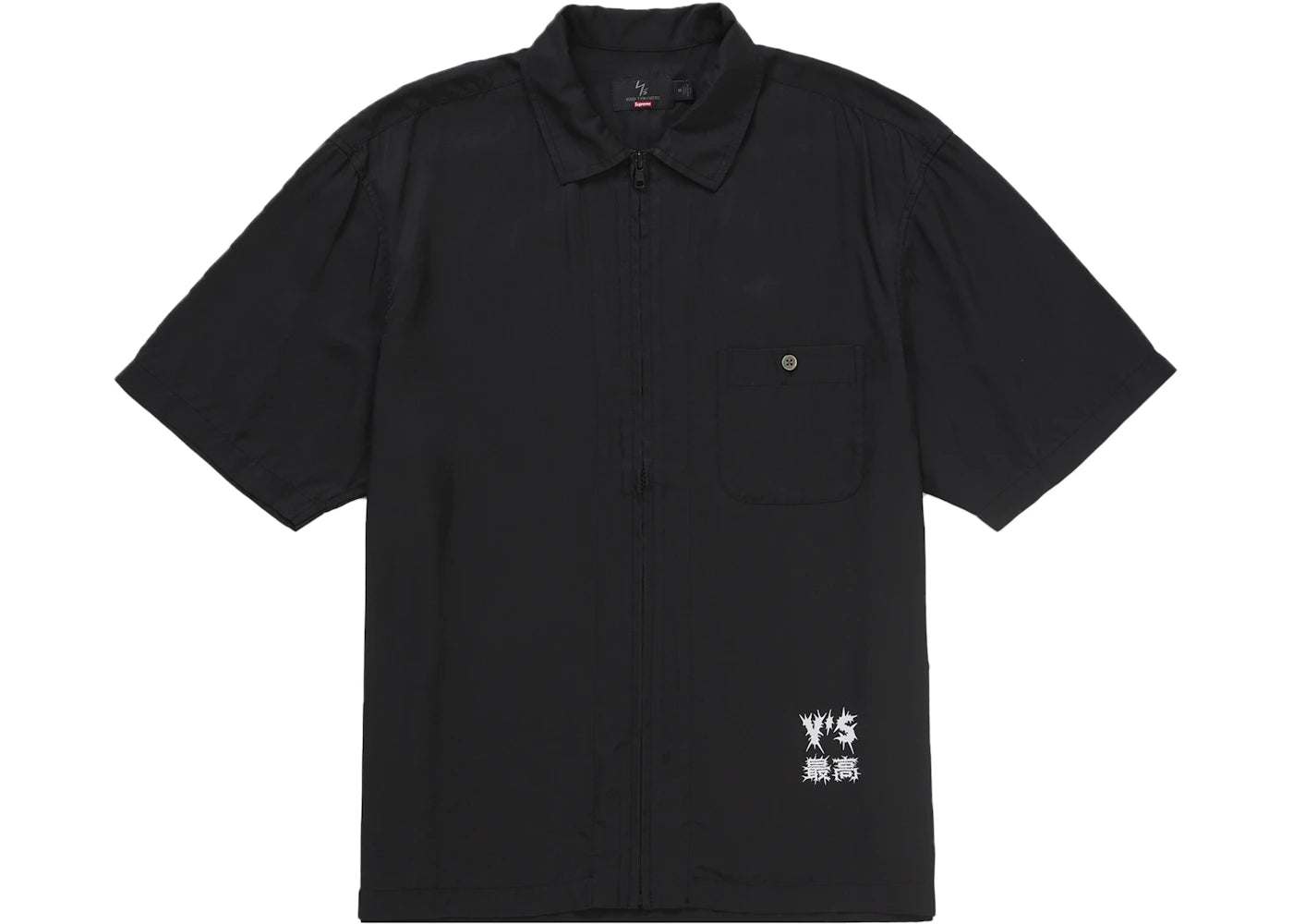
The Supreme x Y's silk zip up shirt now on the site. The woven Y's x Supreme label sits at the collar, first thing you read. Photograph: Supreme, product image.
For the old codes, a Y's cellulose lawn double collar shirt at 660, a Remake Shirt Type 4 at 690. Remake is a name that does what it says.
Shape fools at a distance and photographs flatter. The label was there the whole time. Start at the nape.